Self-directed data visualization · 2025
IMDb Top 1000 Power BI Analysis
I taught myself Power BI by exploring how film patterns change across decades and genres.
- 1,000
- films explored
- 15
- KPI cards
- 4
- report pages
- Role
- Analyst and dashboard designer
- Tools
- Power BI · Excel · Kaggle
The challenge
What needed to change
I wanted to demonstrate an end-to-end data-visualization workflow after losing access to the paid Tableau environment I originally planned to use. That constraint became an opportunity to teach myself Power BI through a subject I already cared about.
My contribution
Responsibilities
- Selected and assessed the public IMDb Top 1000 dataset.
- Cleaned gross revenue, year, and decade fields in Excel.
- Designed four report pages and 15 KPI cards in Power BI.
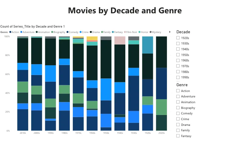
- Built filters and visual comparisons for ratings, revenue, genre, votes, and time.
The system
Approach and decisions
- Prepared numeric gross values and consistent year groupings before visualization.
- Used overview KPIs to establish scale before moving into deeper comparisons.
- Compared gross performance with average ratings by decade using coordinated chart forms.
- Added genre and decade slicers so viewers could examine different subsets without rebuilding the report.
The result
Outcome
The finished four-page report covers 1,000 films through 15 KPI cards, top-ten analysis, rating trends, decade comparisons, genre distributions, and interactive filtering.
Attribution: This was a fully self-directed analysis and dashboard-design project.
The analysis uses a public Kaggle dataset and contains no private or sensitive information.
Evidence